CMYK & RGB are two common color spaces in printing & graphic design. What is the difference, why does it matter, and how do we properly use each?
The Basics:
CMYK creates colors with pigment, RGB creates colors with light.
CMYK:
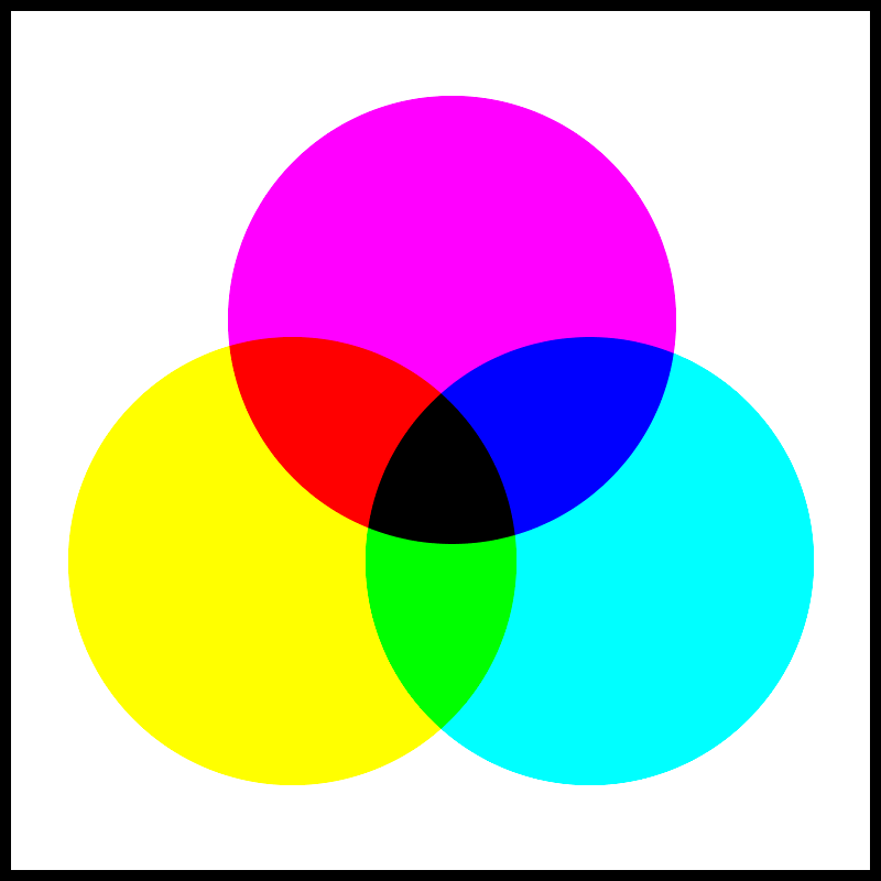
Printing with cyan, magenta, yellow, and black ink is the standard way to commercially produce images with pigment. It’s a subtractive color process. Even though we’re adding ink to paper, that ink absorbs light, which subtracts wavelengths of light that would otherwise bounce off a white sheet.
The CMY model is similar to the red-yellow-blue color wheel, used by painters for centuries, codified by Newton in the 17th, and still taught in grade schools today. Printers shift the red and blue to magenta and cyan to create a wider range of colors, and add a black layer for richer shadows and extra detail. A separate black layer also isolates black type (a common feature in print) onto a single plate where it’s easier to control. The “K” in CMYK comes from key plate, which is the plate that carries most of the discernible information—type, outlines in illustrations, or shadow detail.
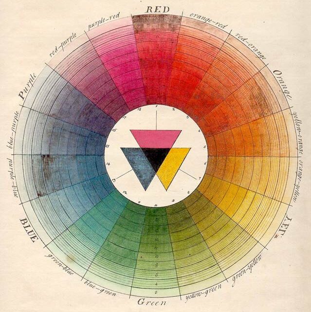
Moses Harris, 1776
RGB:
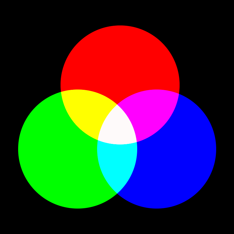
RGB refers to Red–Green–Blue and is an additive process that uses light to create color. This corresponds to how our eyes work naturally: our retinas contain cones that receive short, medium, and long wavelengths of light (which we perceive as blues/violets, greens/yellows, and oranges/reds, respectively). When all of these bands of wavelengths are added together, they create what we perceive as white light. A computer screen creates white by turning on the red, green, and blue lights in a pixel. A digital camera records an image by striking the red, green, and blue detectors on an image sensor and sending a varying amount of voltage through a conductor. RGB devices create black by turning the lights off or sending zero voltage through the conductor.

A word about color theory:
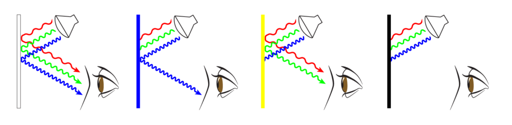
When we look at colors, we’re not seeing an inherent color. We’re seeing wavelengths of light either shining directly at us or bouncing off a surface. When we look at a computer/smartphone screen, millions of tiny LED lights are shining right in our face. When we look at a car, we’re seeing light bouncing off the bodywork.
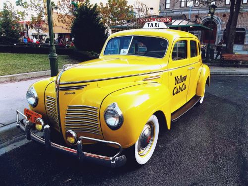

If we look at this car under a streetlight, or during a cloudy day, is it the same color as the same car in bright sunlight? Well, yes and no.
If you define color by color space, the car is covered in the same paint no matter what time of day—the paint hasn’t changed. “Color space” simply refers to a collection of colors: CMYK is a color space, Pantone guides are color spaces, auto body paint chips are color spaces, Peanut M&Ms are a color space. If we define color by its space, then yes: the car is the same color day or night.
The tricky part comes when you try to define color by perception or measure it by wavelength. Sunlight is full-spectrum light (it contains all wavelengths) but the streetlight produces a narrower spectrum. The streetlight creates less light available to bounce off the car in the first place. Even clouds filter sunlight—with less light available to bounce off objects, those objects will appear darker during a cloudy day. Distance also makes a difference: shorter wavelengths penetrate atmosphere more effectively than longer wavelengths (this is why the sky appears blue: the atmosphere is basically filtering out the rest of the light), so objects that are further away tend to appear bluer. Even the lenses in our eyes absorb a tiny amount of the longer wavelengths, and the S-cones (which receive short wavelengths: blues & purples) perceive more definition in low-light conditions (this is why things tend to look bluer at dusk or dawn). So if we define color by what we see, then no, the car is definitely not the same color at night.

Why does this matter?
When we print, we’re using a CMYK process. Images created with an RGB process (like digital camera photos) need to be converted. Web graphics should be created as RGB, because they’re designed to be viewed through RGB devices. But if print graphics need to match web graphics, they need to be converted. And even if there are no photos or web graphics involved in the artwork to be printed, viewing a PDF proof on a smartphone or computer screen means you’re using an RGB device to view a CMYK proof.
The type of paper affects the color you see printed on it—different shades of white can shift ink colors, textured stocks scatter more reflected light, uncoated stocks absorb more light than coated stocks—even if we use the exact same ink on two different sheets, they can look like two (slightly) different colors after printing. Are they the same color or truly different colors? Well, like the car, if you’re comparing based on the name of the ink on the can, they’re the same. If you’re measuring by what you see, they’re different.
In printing, it’s important to standardize as many conditions as possible when matching color: environment, lighting, paper stock, even the person or device measuring color.
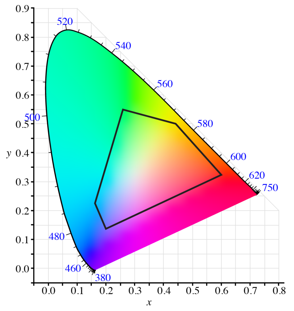
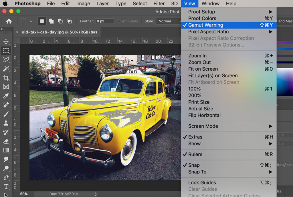
So it’s important, both when creating your print job and when viewing proofs, to know when this matters: sometimes the color is critical and sometimes it isn’t. RGB generally has a “wider gamut” meaning there are more colors that can be created with an RGB device than can be reproduced with a CMYK one. So if you send an unconverted RGB photo to print, the bluest blues and the reddest reds will look duller when printed than they do on a screen. 0-0-255 in an RGB color model (100% blue) is unachievable with any CMYK process because it’s outside of any CMYK gamut. No amount of CMY pigment on a sheet will replicate 100% blue light. We can get closer with spot colors (more on this in a couple of paragraphs).
Calibration plays a part, too: when we send proofs electronically, there’s no guarantee that the colors even look exactly the same on one computer monitor as they do on another.
How can I have more control over the way it prints?
If color is critical, convert your files to CMYK before sending to print. The Adobe Graphic Design Suite (Photoshop, Illustrator, InDesign) has several tools to do this.
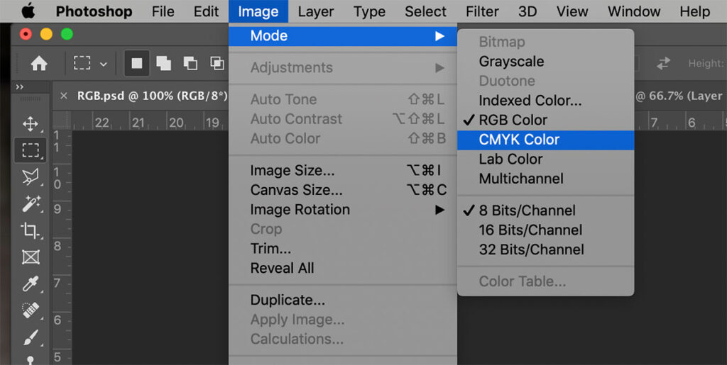
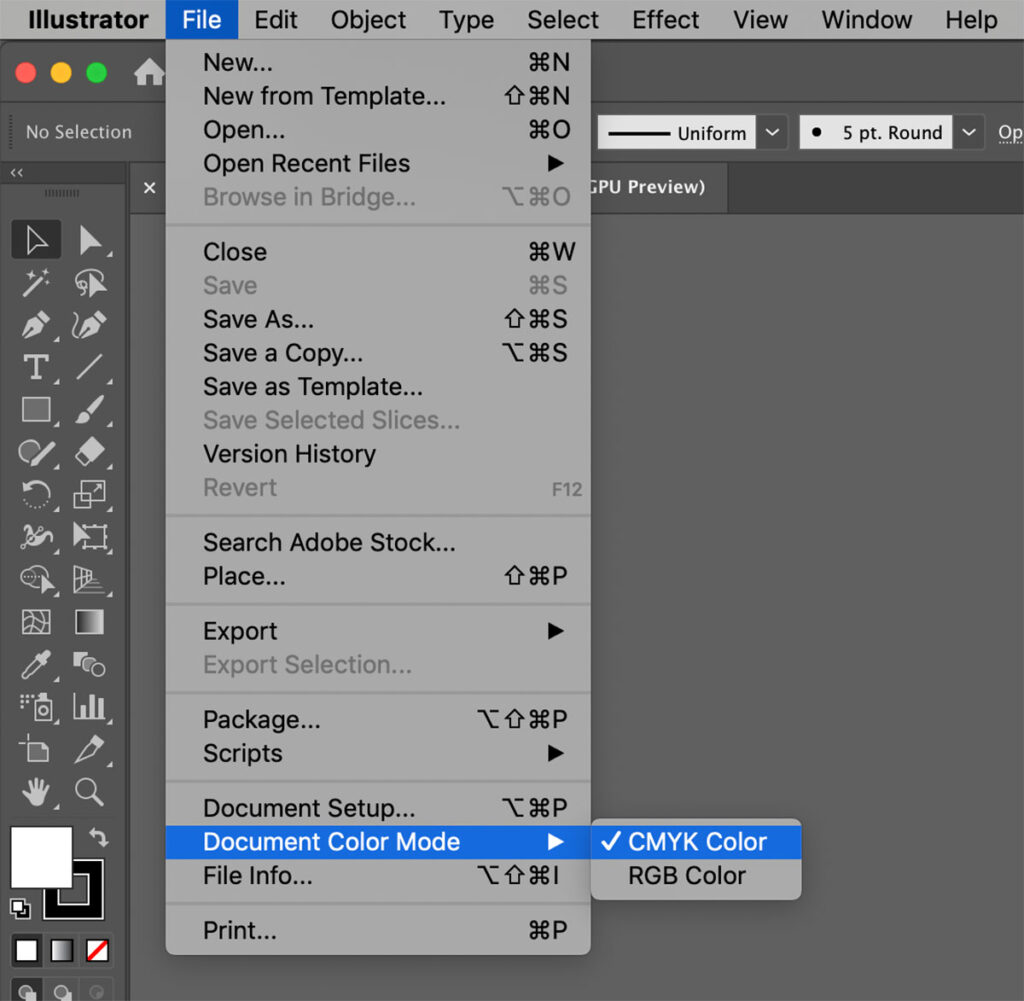

If you don’t convert everything to CMYK, it may not be a big deal. Most photos and graphics fall within a common gamut. But that means our processors or print engines will have to do the conversion instead—and you have less control over the result. Converting to CMYK before sending a file to print gives you the most control over your artwork: you can edit the saturation and color balance if it doesn’t convert quite the way you expect it to.
Be aware that when you convert an image or color to CMYK, the image you are actually viewing is a simulation of a CMYK image, since you’re still viewing it on an RGB device (your computer monitor). Changing the color channels that compose the image (red-green-blue to cyan-magenta-yellow-black) may change the way certain transparency effects function. Screen, lighten, and overlay can look very different; multiply and darken usually look the same. Also be aware that you are not saving a color profile, simply converting the color space. In other words, just because the image is now CMYK, that’s still no guarantee it will print exactly the way it looks on your screen, unless your screen is calibrated to the exact model of printer that will print the final job.
A quick word about spot colors:
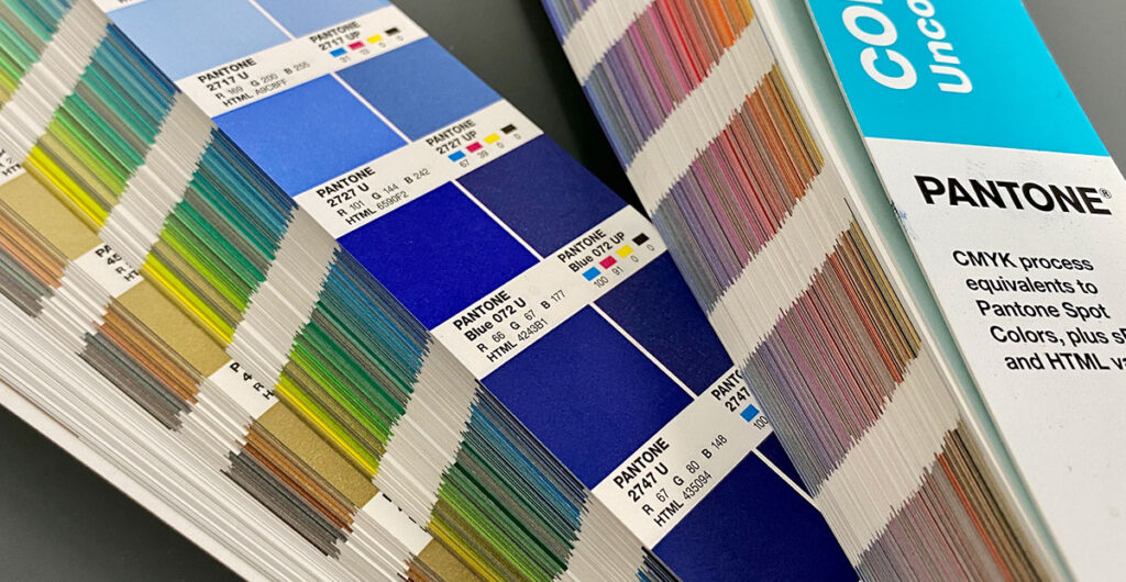
Spot colors are pre-mixed inks that we can put on a press instead of, or in addition to, CMYK process inks. They are often (but not always) brighter & more vibrant than colors in a CMYK gamut. Pantone is one of the most widely-recognized names in spot color inks; they’ve established a large degree of standardization in the industry by publishing sets of spot color swatches. These are like paint chips, meticulously produced in a facility with carefully-controlled standards, so that the designer, the prepress tech, the press operator and the ink mixer all have a standard to which to compare colors.
For a more in-depth look at spot colors, click here.

There may be times when you use spot colors in a design but wish to convert them to CMYK for printing (there are many reasons you may want to do this, but cost is usually the main one: adding spot colors to CMYK artwork adds time & complexity to a print job). If you’re using spot colors as CMYK, it might be useful to consult a Pantone Bridge guide. This is a printed guide, produced by Pantone, that shows how closely CMYK inks will replicate spot colors. If you don’t have a Bridge Guide of your own, most print shops should have one they will let you look at (they’re expensive, though, so we generally don’t loan them out!)
A slightly lengthier word about HEX codes:
Hex stands for hexadecimal, and it’s a concise way to notate RGB colors in HTML (most often for websites). Hexadecimal is a base-16 numbering system. We count most things with a base-10 system (count 0-9 in the “ones” place; after 9, put a one in the “tens” place and start over with 0 in the “ones” place). Hexadecimal works the same way, but uses 15 digits (0-9 plus A-F). You’d count 0-F in the “ones” place, reset to zero and put a one in the “sixteens” place, then start over with zero in the “ones” place. It’s way for coders & programmers to condense 256 values into a 2-digit number (256 is significant because it’s the maximum amount of values possible with 8-bit computing. 8 on/off switches have 256 different possible combinations. In computer programming, “on” or “off” equates to a binary 1 or 0; these 8 switches become the 1’s and 0’s that make up an 8-bit computing component, otherwise known as a “byte”).
In a HEX code, the first 2 digits are the red component, the next two are blue, the last two are green. 8-bit color combines 256 values each of red, green, and blue. You’ll most often see RGB colors listed as a range from 0 to 255 (for example: “R=233, G=032, B=200”), where CMYK colors are typically given as percentages, from 0%-100%.
Here’s an example. R=233/G=032/B=200 would have a HEX code of E920C8.
E9 is the red component, 20 is blue, C8 is green.
E9 = 14×16 + 9×1 = 224+9 = 233.
20 = 2×16 + 0x1 = 32+0 = 32.
C8= 12×16 + 8×1 = 192+8 = 200.
| 0=0 | 2=2 | 4=4 | 6=6 | 8=8 | A=10 | C=12 | E=14 |
| 1=1 | 3=3 | 5=5 | 7=7 | 9=9 | B=11 | D=13 | F=15 |
It’s common to see HEX codes in brand guidelines, where designers attempt to create consistency across a wide range of media (print & screens). If they want to make sure web developers use the same red in a logo, for instance, they might provide a HEX code of FF0000 (R=255, G=0, B=0), a 0/100/100/0 CMYK build, or a Pantone 185 C spot color. This will ensure that every time a web builder wants to use the same logo red in a web page, they can insert “FF0000” directly into their HTML code. But it does not mean that FF0000 is an exact match to Pantone 185 or 0/100/100/0 CMYK—it’s simply what the designer has set as a standard in each color space. If they only provided a Pantone color, every web developer who converted to RGB/HEX could arrive at a slightly different formula.
For a more thorough explanation of how to use spot colors in print, click here.
So… how can I be certain it will print the way I want it to print?
Talk to your printer, be clear about your expectations, and ask for a hard copy proof! At Seattle Printworks, we strive to assess your expectations up front so we know what’s critical and create proofs that resemble the finished print job as accurately as possible. Sometimes a fast turnaround is more important than 100%-accurate color, so it’s important to tell your printer when “close enough” will do. If you have a previously-printed sample to match, mail it to us or drop it off in person.
We frequently schedule a press check when a color match is subjective. Maybe the ink color on your event invitation needs to match the table runners (paper and textiles never match 100% because they absorb light and produce shadows differently). We’d invite you in to see the first few sheets off the press. You could bring in a swatch of the table runner, hold it side-by-side against the printed invitation, and we’ll make fine-tune adjustments (if necessary) before printing the rest! We want to make sure you like what you see.
We can discuss color theory, color spaces, and lighting conditions until we’re blue in the face but that doesn’t change the fact that what you print should look the way you want it to. Communicate your expectations clearly, and your printer should be able to make it work!